
Spotted an emblem you can’t place? This is your visual cheat sheet — every major car badge organised by what it actually looks like, so you can find it in seconds.
Trying to identify a badge you saw on a car? This guide matches common logo shapes with brand names, then gives you a visual directory of 50 car brands, EV logos, and quick clues for symbols such as a plus sign, V shape, slanted H, rings, stars, wings, and animals.
Identify a Car Logo by Its Shape or Symbol
Most people remember the shape of a badge before they remember the manufacturer. Look for the strongest clue: a letter, cross, V, star, ring, wing, shield, animal, or wordmark. Then compare it with the likely brands below.


What Car Brand Has a Plus or Cross Logo?
Two of the most useful comparisons are Chevrolet and Polestar. Chevrolet uses its well-known bowtie emblem, which can appear like a wide cross or plus sign at a glance. Polestar uses a sharper geometric mark formed by opposing shapes, which many drivers describe as a plus, cross, or four-point star.

What Car Logo Looks Like a V?
A V-shaped car logo can belong to more than one brand, so check whether the V stands alone or sits inside another shape. VinFast uses a prominent V-style emblem. Volkswagen combines a V with a W inside a circle. Acura and Infiniti can also look V-like from a distance because of their pointed center shapes.

Which Car Brand Has a Slanted H Logo?
The slanted H car logo is Hyundai. Its emblem uses a tilted H enclosed by an oval, making it easy to confuse with a simple abstract symbol when seen from a distance. Honda also uses an H, but Honda’s badge is more upright and sits inside a rectangular frame with rounded corners.

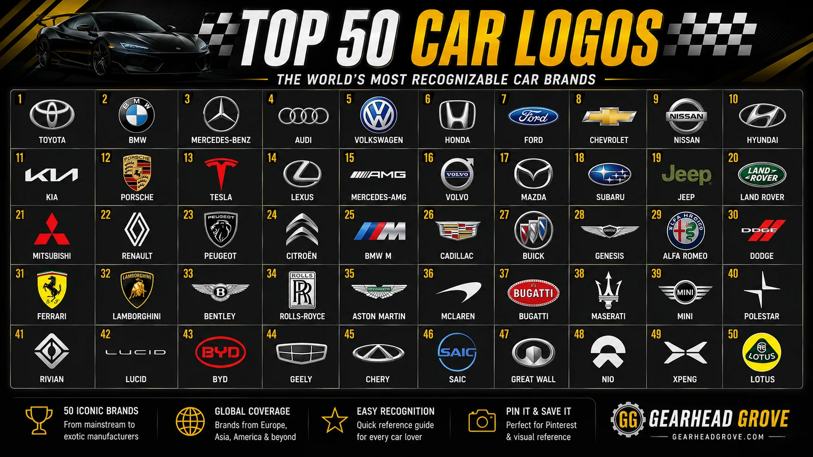
50 Car Brands and Logos With Names
Use this visual directory when you want to browse car logos and names instead of identifying a single symbol. It includes mainstream, luxury, performance, SUV, and electric vehicle brands from major automotive markets.

Toyota
Japan • Mainstream

Ford
USA • Mainstream
Chevrolet
USA • Mainstream
Honda
Japan • Mainstream
Hyundai
South Korea • Mainstream

Kia
South Korea • Mainstream

Nissan
Japan • Mainstream

Mazda
Japan • Mainstream

Subaru
Japan • Mainstream

Mitsubishi
Japan • Mainstream

Suzuki
Japan • Mainstream
Volkswagen
Germany • Mainstream

BMW
Germany • Luxury

Mercedes-Benz
Germany • Luxury

Audi
Germany • Luxury

Porsche
Germany • Performance

Volvo
Sweden • Premium

Ferrari
Italy • Performance

Lamborghini
Italy • Performance

Maserati
Italy • Luxury
Alfa Romeo
Italy • Performance

Fiat
Italy • Mainstream

Peugeot
France • Mainstream

Renault
France • Mainstream

Citroen
France • Mainstream

Skoda
Czech Republic • Mainstream

SEAT
Spain • Mainstream

Bentley
United Kingdom • Luxury

Rolls-Royce
United Kingdom • Luxury

Aston Martin
United Kingdom • Performance

McLaren
United Kingdom • Performance

Land Rover
United Kingdom • SUV

Jaguar
United Kingdom • Luxury

Mini
United Kingdom • Premium

Lexus
Japan • Luxury
Acura
Japan / USA market • Luxury
Infiniti
Japan • Luxury

Genesis
South Korea • Luxury

Tesla
USA • EV

Rivian
USA • EV

Lucid
USA • EV
Polestar
Sweden • EV

BYD
China • EV

NIO
China • EV
VinFast
Vietnam • EV

Geely
China • Mainstream

Chery
China • Mainstream

Cadillac
USA • Luxury

GMC
USA • Truck / SUV

Dacia
Romania • Mainstream
Looking for an even larger directory? Visit the full car logos and names collection.
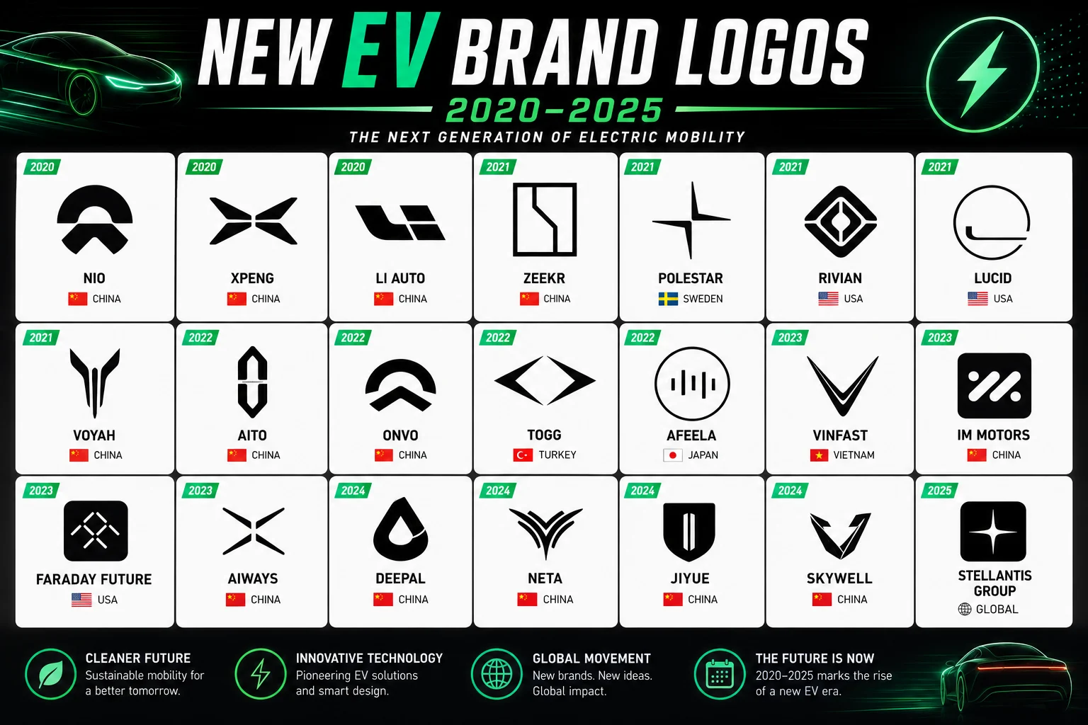
EV Car Brand Logos and Names
Electric vehicle brands often use cleaner, flatter and more geometric identities than older automotive marques. This can make newer badges harder to recognize because they may not use traditional shields, animals, or chrome-heavy crests.
Car Logos Grouped by Symbol Type
| Symbol Type | Examples | Quick Recognition Clue |
|---|---|---|
| Cross / Plus | Chevrolet, Polestar, Alfa Romeo | Check whether the cross is standalone, geometric, or inside a crest. |
| V Shape | VinFast, Volkswagen, Acura, Infiniti | Look for a standalone V versus a V combined with another letter or frame. |
| Letter H | Hyundai, Honda | Hyundai is slanted in an oval; Honda is upright in a rounded rectangle. |
| Rings / Circles | Audi, BMW, Mercedes-Benz, Toyota | Count rings, stars, or overlapping ovals. |
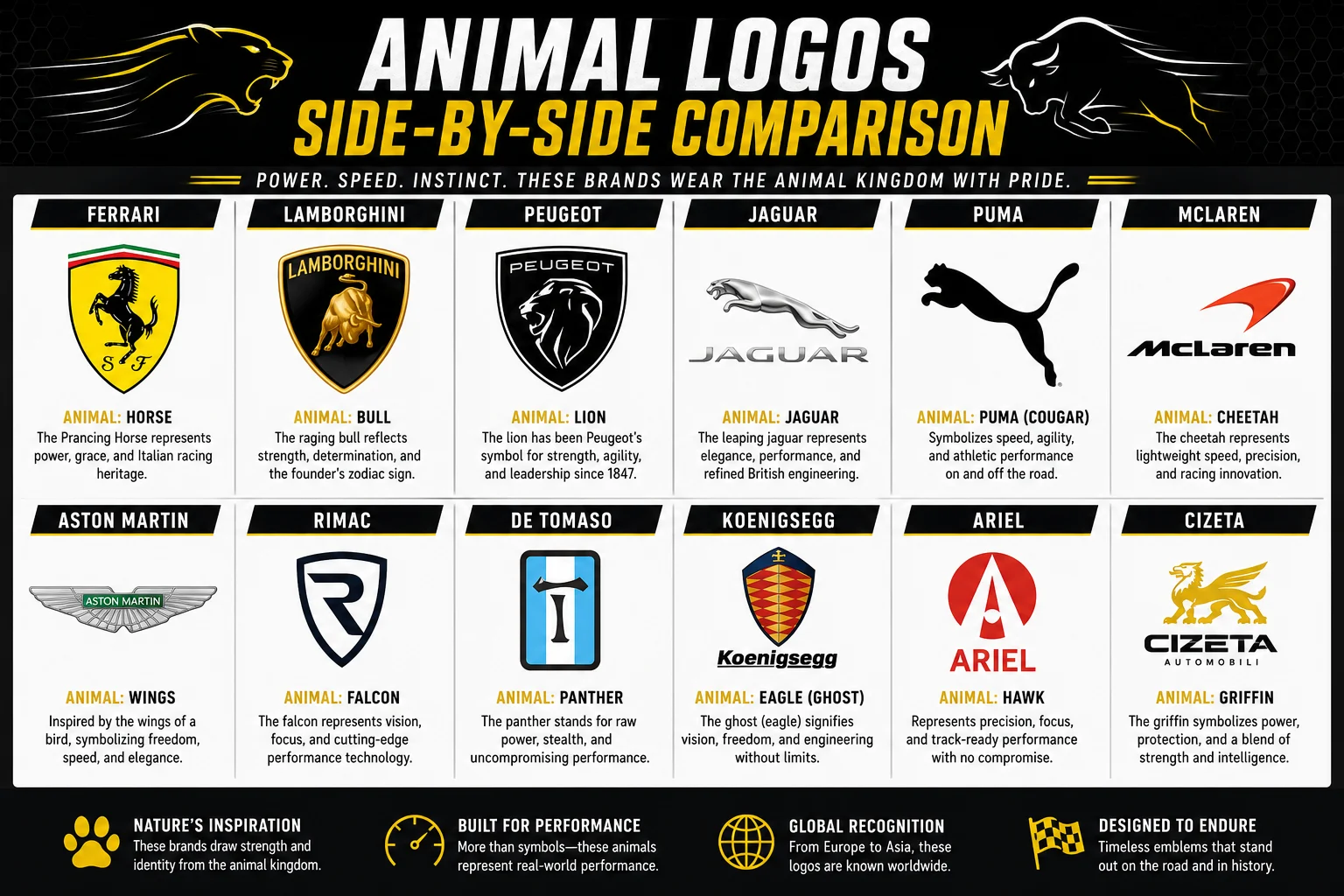
| Animals | Ferrari, Lamborghini, Jaguar, Porsche | Horse, bull, cat, or crest-based animal imagery. |
| Wings | Bentley, Aston Martin, Genesis, Mini | Wide horizontal wings around a central letter or name. |
| Text / Initials | Tesla, Kia, Lexus, GMC | Letters or wordmarks are the primary visual element. |
Car Logos 2026 With Names: What to Check
When comparing a badge with a 2026 car logo list, focus on the version currently used on vehicles and official brand material. Some manufacturers have moved toward flatter, simpler marks, while older vehicles may still carry earlier chrome or three-dimensional badges. The safest identification method is to compare the symbol, brand name, vehicle age, and badge placement together.
Car Logo Searches Around the World
Drivers search for the same information in many languages. Phrases such as araba logosu, automarken namen, marcas de carro, znaczki aut, and bil logoer all reflect the same basic need: match a visible badge with the correct automotive brand. A visual directory works well for international readers because the logo itself is the common reference point.
How to Identify an Unknown Car Logo
Car Logo vs Badge vs Emblem
A logo is the brand’s visual identity. A badge is the physical mark attached to the vehicle, while emblem is a broader term for a decorative brand symbol. You may also see model badges and performance-division badges, which should not automatically be treated as separate car manufacturers.
Frequently Asked Questions About Car Logos
What car brand has a plus sign logo?
Chevrolet and Polestar are two strong possibilities. Chevrolet uses a wide bowtie that can look cross-shaped, while Polestar uses a sharp four-point geometric symbol.
What is the yellow cross car brand?
A gold or yellow cross-like badge is commonly Chevrolet’s bowtie. The emblem is wider horizontally than a normal plus sign.
What car logo looks like a V?
VinFast is one of the clearest V-shaped car logos. Volkswagen also includes a V above a W, while Acura and Infiniti can look V-like from certain angles.
Which car brand has a slanted H logo?
Hyundai. Its logo is a tilted H enclosed in an oval.
What car logo has four rings?
Audi uses four interlocking rings.
What car logo has a three-pointed star?
Mercedes-Benz uses a three-pointed star inside a circle.
What car logos have a horse?
Ferrari and Porsche both feature a horse, but Ferrari’s horse is the main central symbol while Porsche places a horse inside a detailed crest.
Are all EV car logos easy to recognize?
No. Many newer EV manufacturers use minimalist geometric symbols or wordmarks, so shape comparison and the full brand directory are useful when a badge is unfamiliar.
Fast Car Logo Identification Chart
| What You See | Likely Brand | Best Confirmation Clue |
|---|---|---|
| Gold wide cross / bowtie | Chevrolet | Wide horizontal center |
| Sharp four-point plus | Polestar | Minimal geometric star |
| Simple V | VinFast | Standalone V-style emblem |
| V over W in a circle | Volkswagen | Two stacked letters |
| Slanted H in oval | Hyundai | Tilted letter form |
| Four rings | Audi | Four side-by-side circles |
| Three-point star | Mercedes-Benz | Star inside circle |
| Blue and white roundel | BMW | Quartered circular center |
| Charging bull | Lamborghini | Bull inside shield |
| Prancing horse | Ferrari | Black horse on yellow field |